This article is also available in:
![]() Français
Français
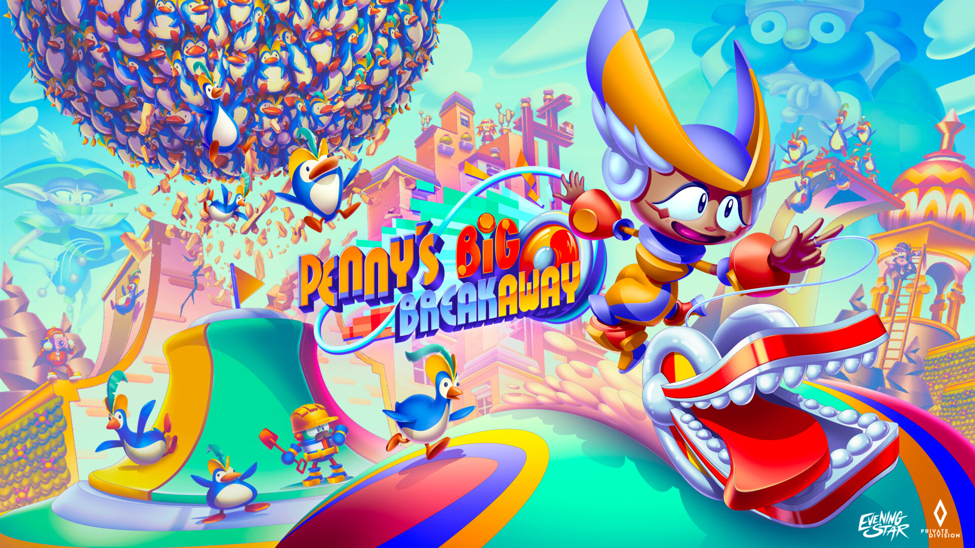
A street performer and her yo-yo in a colorful world, fleeing hords of penguins: Penny’s Big Breakaway definitely won’t leave you indifferent!
Developped by Evening Star and published by Private Division, the game was released February 21 on Nintendo Switch, PlayStation 5, Windows, and Xbox Series X/S.
We invite you to get behind the scenes and learn more about Penny’s Big Breakaway alongside Evening Star art director Tom Fry. He previously wokred on Sonic Mania. He told us about the birth of the core concept behind the game, as well as the overall artistic challenges : characters, world building, architecture, color, animation, and more.
Here is the trailer, followed by our interview!
3DVF: A street performer, an audition in front of the king, a living Yo-Yo, a penguin army: Penny’s Big Breakaway definitely stands out. How did the overall concept for the game came to be?
Tom Fry: It’s quite an eclectic and zany mix of elements to be sure. But when holding our creative knives and forks at the ready, we don’t consume the entire technicolor elephant all at once! It was, and has always been a very collaborative exercise with the wider team all throwing ideas and suggestions into the pot. At the very beginning we started out discussing different verbs and how these actions could apply to a video game. One of those verbs was “yo-yoing” which had immediate resonance and so we were off to the races.
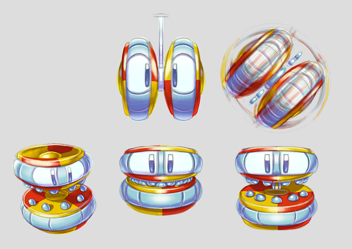

Usually we like to think of the raw gameplay/design mechanics first and what would be engaging to the player and then build narrative context around that. We wanted Yo-yo to be a powerful tool for Penny and so the idea of it behaving like a loving but unruly puppy sprung out of that, which in turn lead to the narrative thrust of Penny attending a grand audition that goes wrong when Yo-yo loses control and eats Emperor Eddie’s clothes.

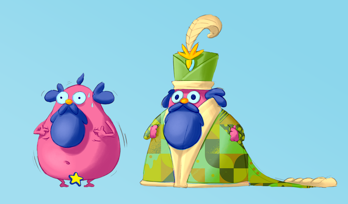
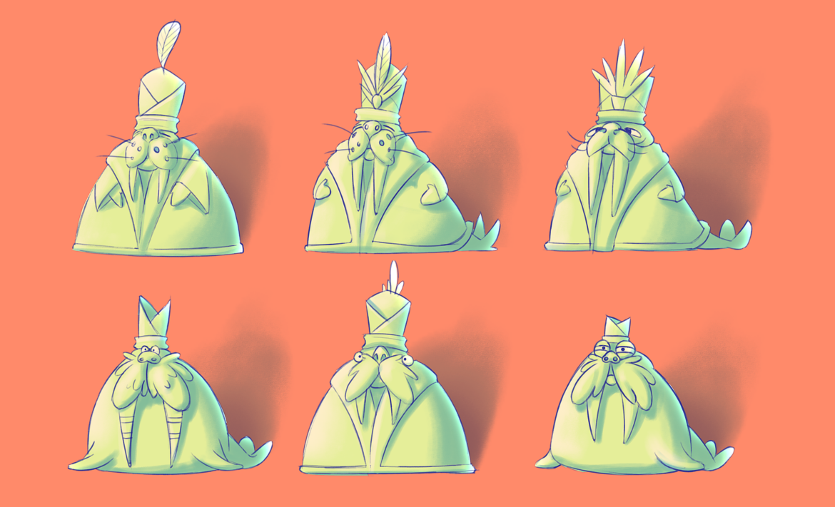
For the Penguin adversaries, the idea initially was simply around an enemy that is copious in number like a swarm, so that the player does not need to focus on combat with a series of singular foes. Off the back of this, we thought it would be fun for the player not really to have to engage this swarm, but rather find speedy pathways to escape, but every now and again they could turn the tables with a power up that could blast them out of the way like bowling pins – it was this particular image that conjured up the idea of a penguin that could adopt this shape.
3DVF: Can you walk us through the creation of the world of Macaroon and its architecture?
Tom Fry: Rather like with the overall approach to the game’s design, we took the pragmatic path at first of looking at what we wanted to achieve with our tools for level creation, the level of fidelity we wanted to hit with the graphics and how this could all fit comfortably within schedule which would then be used to inform Macaroon’s visual identity.
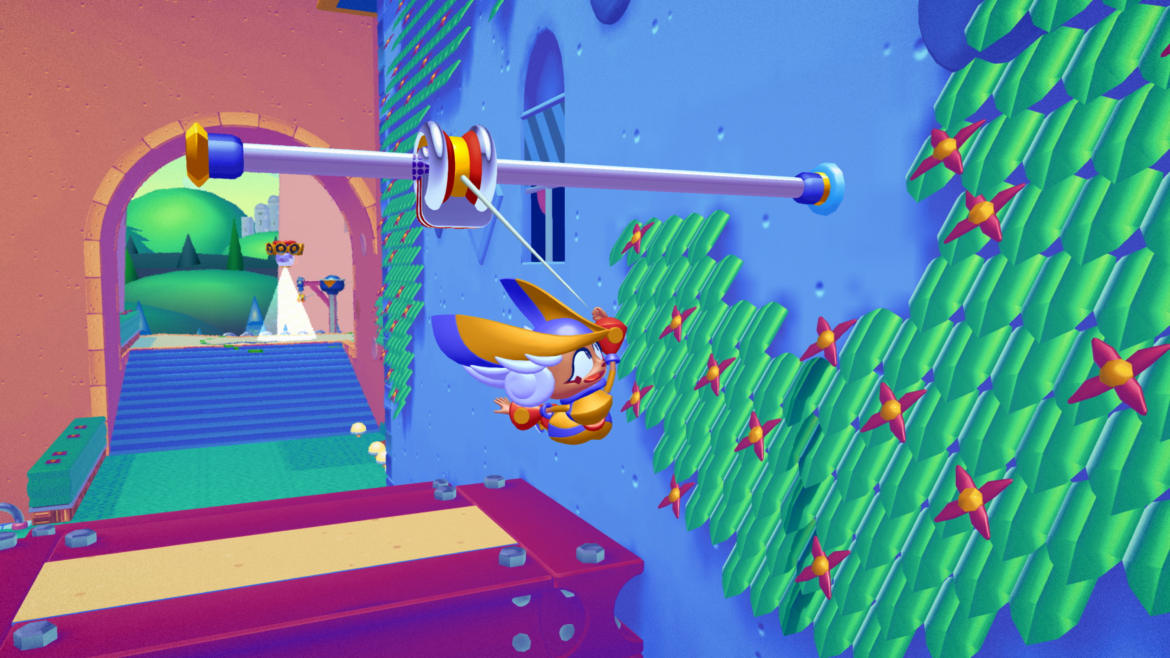
Sweeping primitive geometry is a cornerstone of Penny’s Big Breakaway‘s level design allowing players many opportunities to build momentum and soar to great heights and it was the Bauhaus design movement that felt like a natural source of inspiration for the set-dressing, so to speak. This movement showcases the beauty of the economy of design and it is a philosophy we upheld during development – one which I hope is apparent that we’ve executed with confidence and panache.
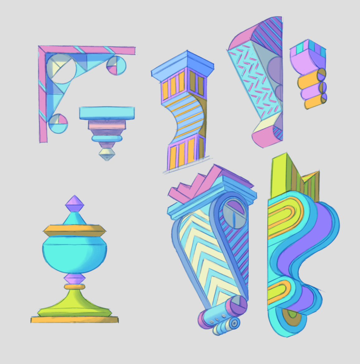
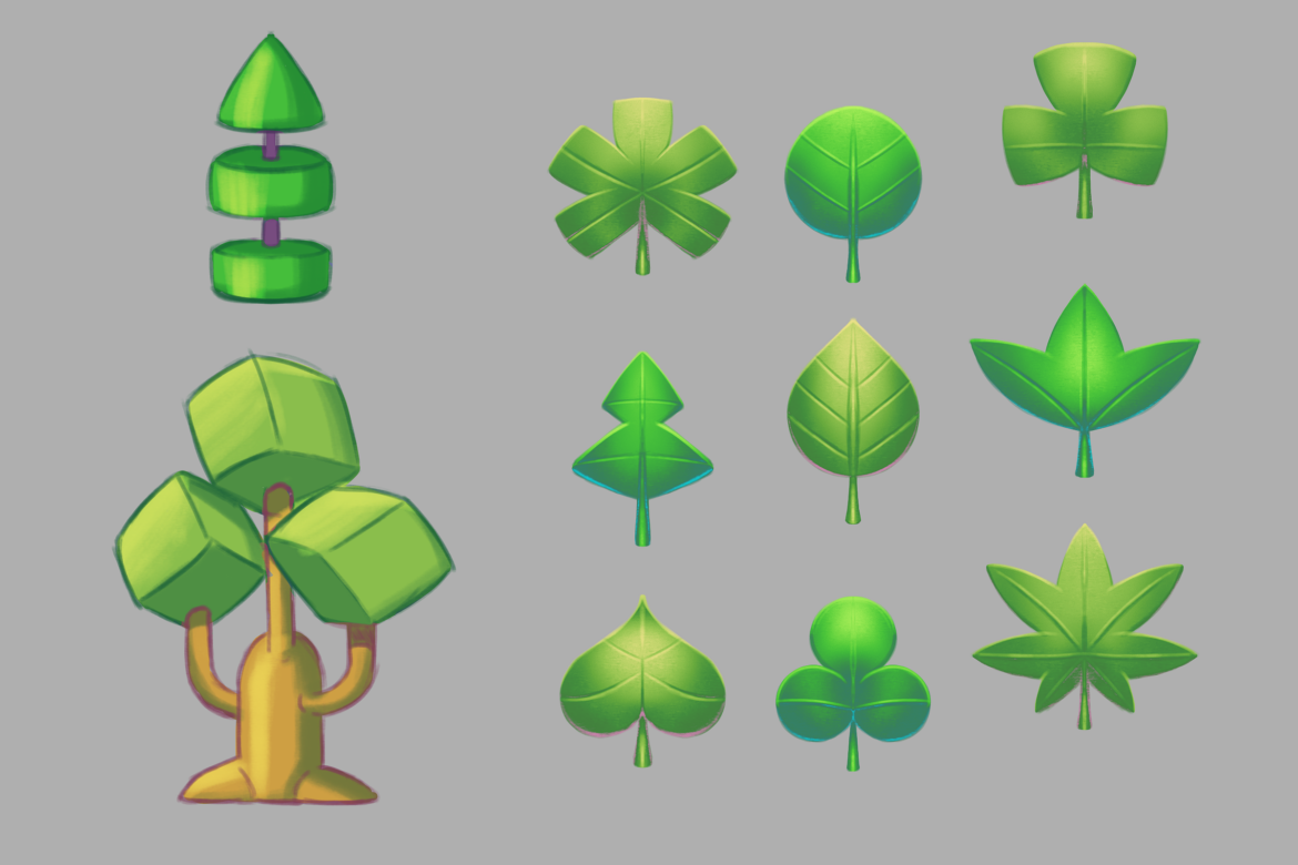
3DVF: Penny’s Big Breakaway features bold artistic choices, for example when it comes to the color palette. How did you approach it?
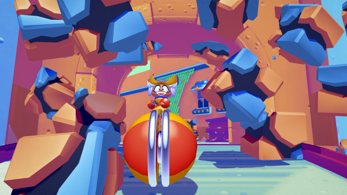
Tom Fry : The way we approach the application of colour in Penny’s Big Breakaway is in some ways a little unconventional when compared to how many other modern 3D games and engines approach the essentials such as texturing and lighting. We use a proprietary Gradient Shading system for applying colour to all 3D meshes in the game which bears some similarity to how older 8-bit and 16-bit consoles would use palette indexes for sprites and tiles. Every mesh is segmented and adorned with a myriad of gradients, and the artist can make explicit colour choices for tone, midtone and highlights. The overarching rule for any gradient in PBB is that the shadow values should skew very much toward blue, whereas the highlights are much warmer – orange/yellow. The collective result is a palette that can feel saturated and iridescent, delicious like polished, sweet candy!
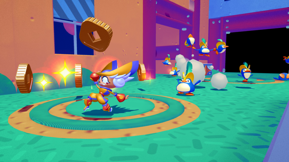
3DVF: Can you tell us more about Penny, her character design and the animation challenges you faced during game development?
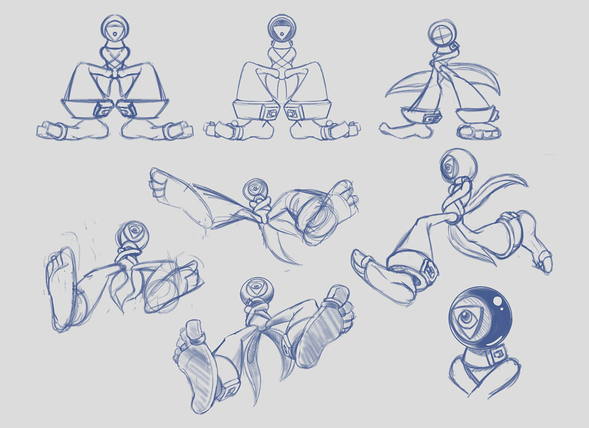
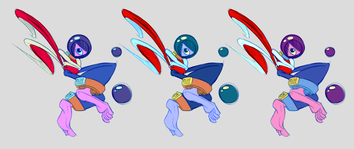
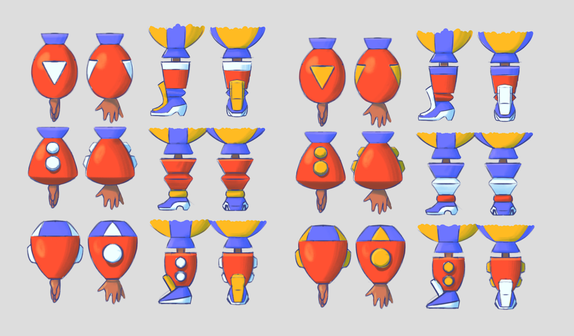
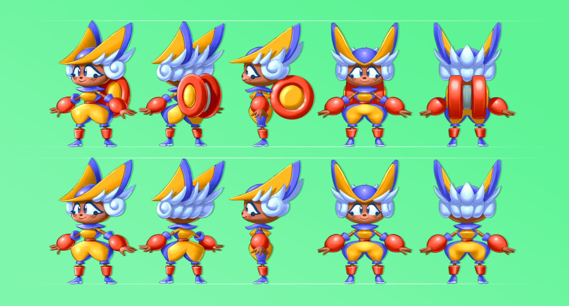
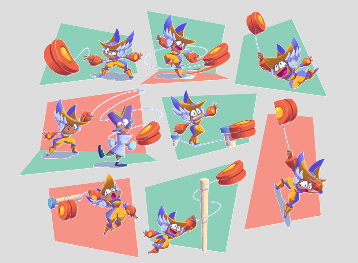
Tom Fry: Penny is a plucky but unlucky performance artist looking to find her place in the world of Macaroon. Alongside much of the rest of the cast, her design was partially informed by the Bauhaus movement, same as with the environments. However, there is a specific performance piece called the Triadic Ballet which makes use of surreal abstractionist geometric costume design which clicked and felt like a solid avenue for solving early queries in conceiving something memorable.
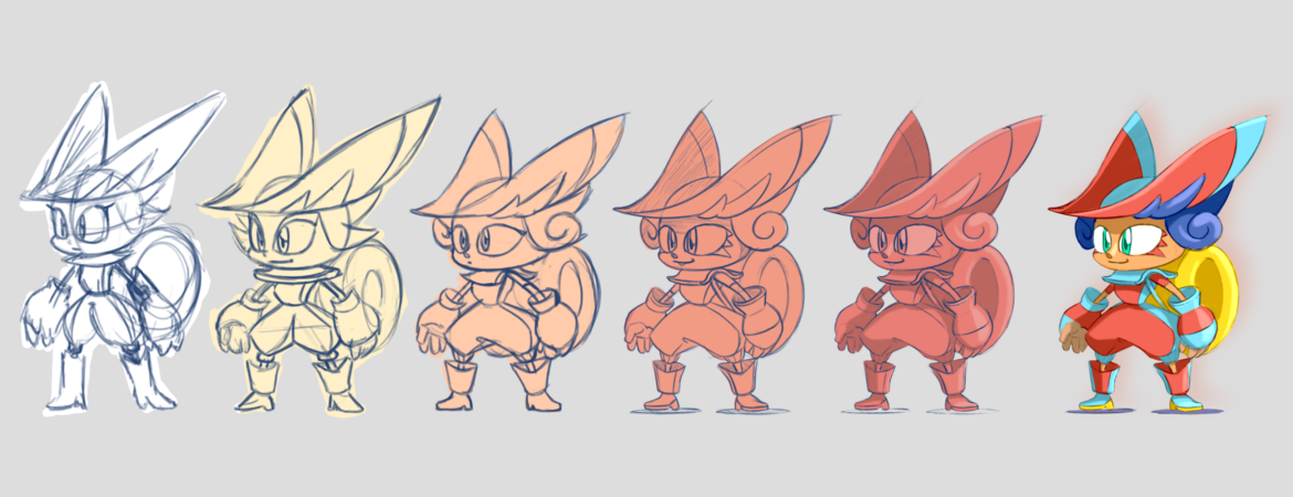
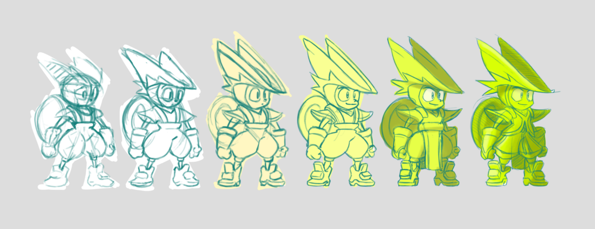
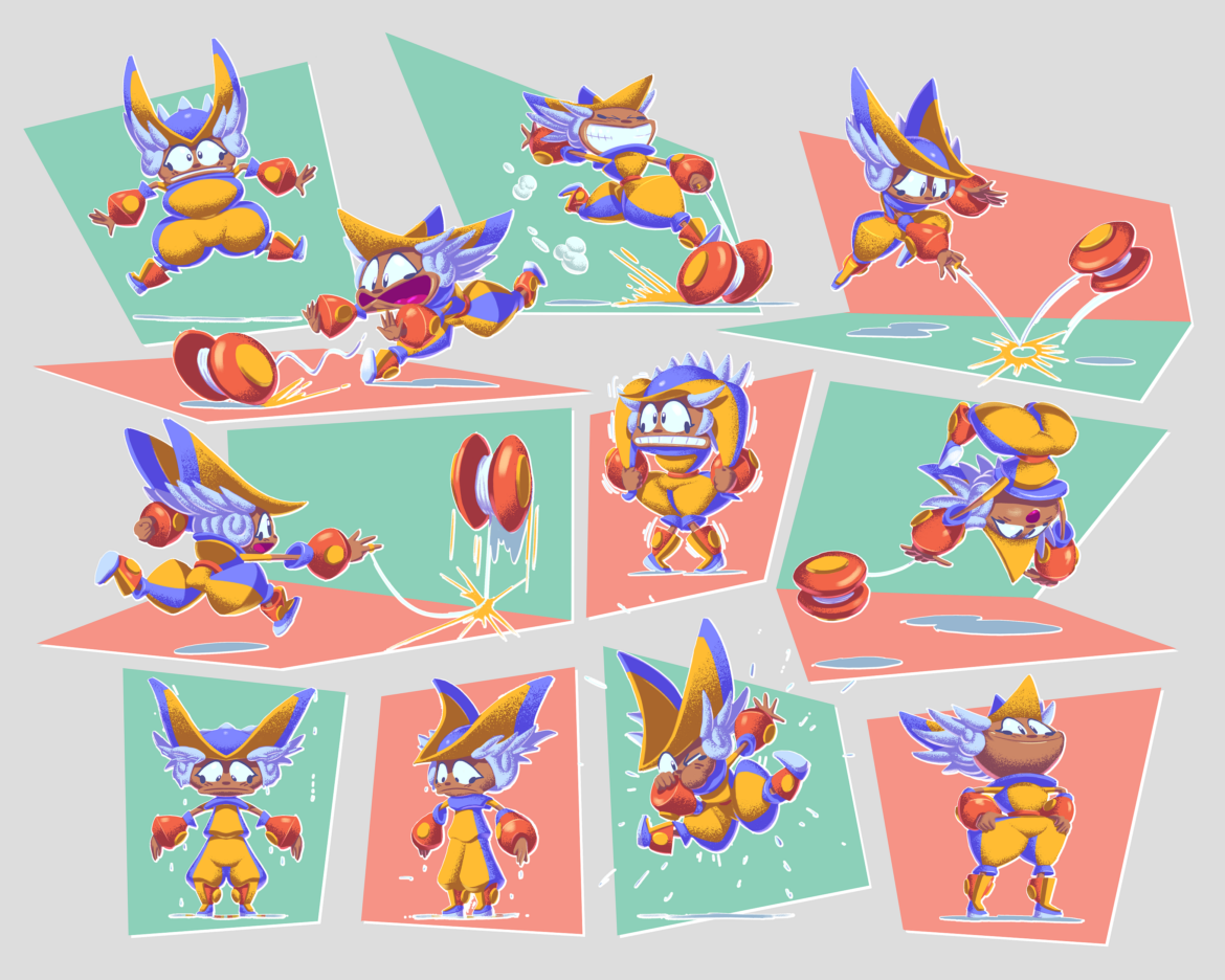
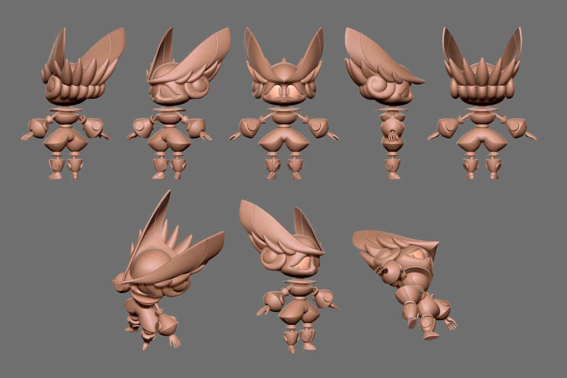
In terms of her facial design and expressions, inspiration was drawn from both Western and Japanese animation. Speaking of which, our approach to animation was largely grounded in Western principles of squash and stretch which can push the character rigs close to breaking point when they’re literally being pulled in all directions.
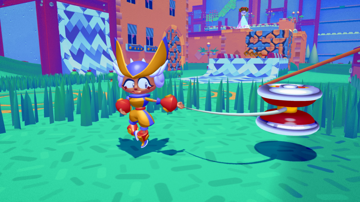
Our Senior Artist Rémi Benoist helped to call out and solve a lot of technical issues with Penny’s rig early on to ensure that she could do things like stand and walk naturally, whilst keeping her unique (and sometimes challenging!) costume silhouette intact. There was a fair bit of careful iteration on her design early on to strike this balance.
3DVF: What about the penguins? They can mob together when trying to attack Penny. Was it difficult to achieve these crowds, and how did you find the right balance?
Did you tweak the color palette of the world or the character designs to make sure the player would always be able to understand what’s happening on screen?
Tom Fry: As Penny and the Penguins’ designs were determined early on, it was very much about ensuring the relationship between their colour schemes was suitably balanced and contrasted, like yin and yang.
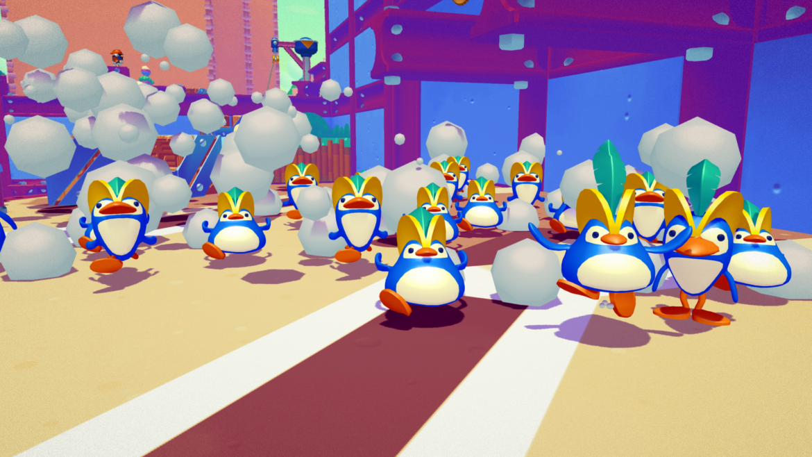
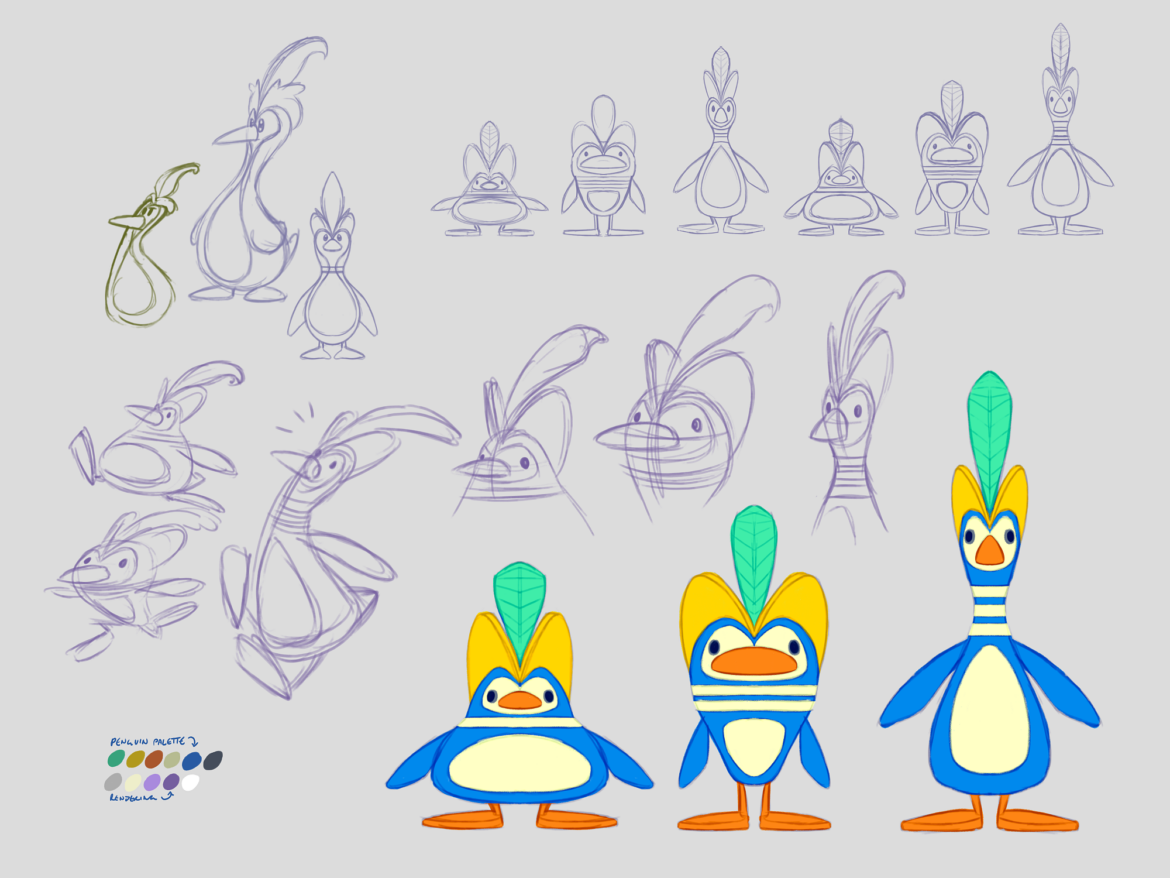
Much of the world design was decided after and so those choices were informed by Penny and the Penguins’ design. With Moltobene and Zaphara, these two worlds are predominantly yellow and blue respectively – a bit tricky with those being the primary colours of our Yo-tagonist and antagonist foes! Because of the gradient system, we were able to fine tune the balance of these world palettes against the characters to ensure the hues and luminance values allowed for them to pop against their environmental backdrops.
3DVF: Tom, thanks for your time and for these answers! And to our readers, Penny’s Big Breakaway is available on Nintendo Switch, PlayStation 5, Windows, and Xbox Series X/S.
For more information about Penny’s Big Breakaway
- The official website.
- Evening Star in our list of studios.
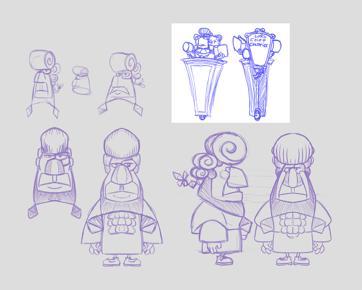
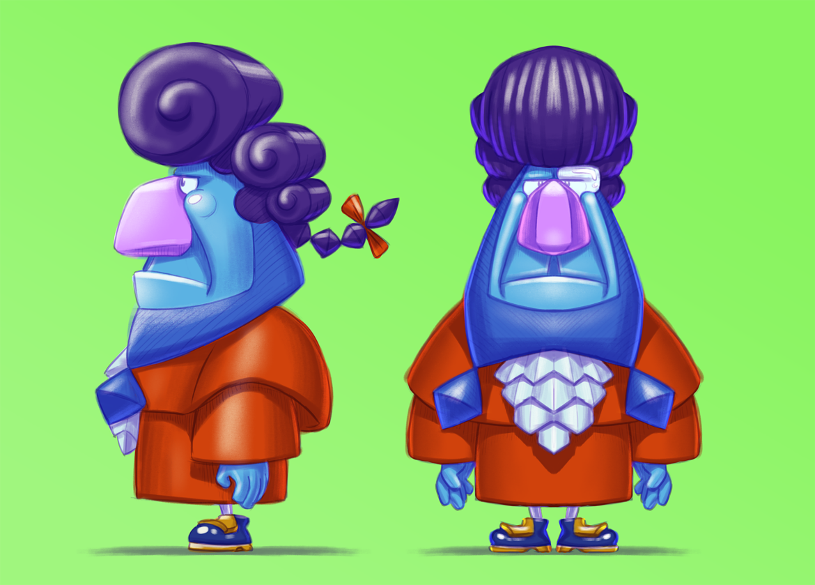
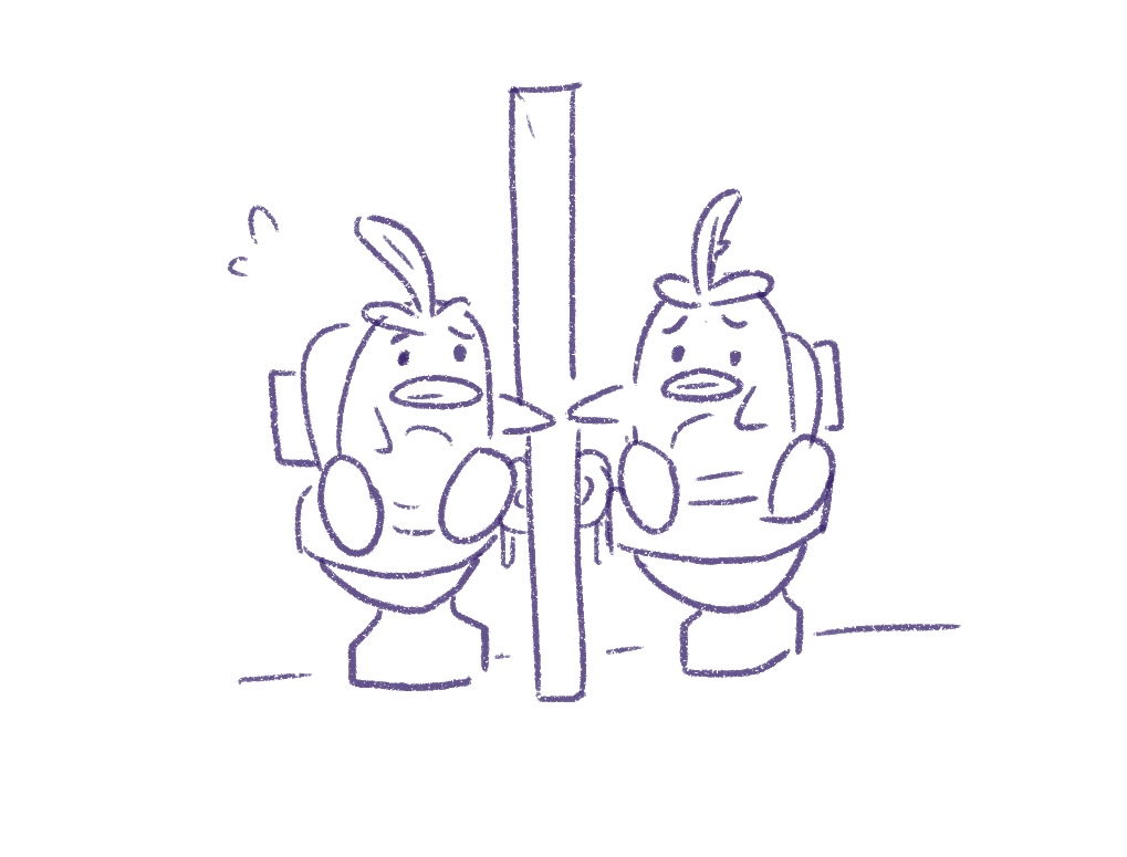
- Last, but not least, here are a few more concepts/artworks from the game:
